During my second semester at UIC, I joined the Women in Computer Science Web Development Team. For that semester, the focus was curating our own personal websites. Each weekly meeting would focus on a new concept, and you could choose how to apply it to your own website. As a freshman, this was the perfect introduction to tackling my first personal project.
Table of Contents:
Design
Before we began programming, we designed our websites using Figma. I wasn't too sure what I would be able to achieve, so I created a simple design:
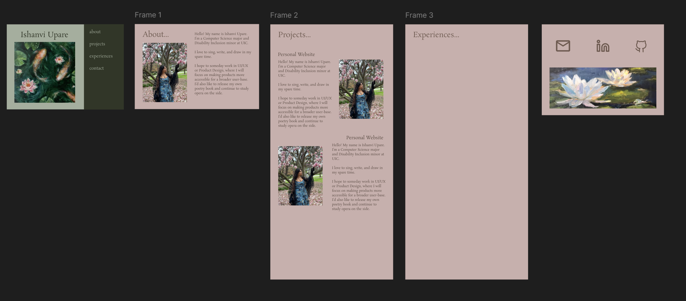
I was inspired by this art book in particular:

I also used my favorite color palette from "Welcome to Bloxburg."
Setup
We began with a setup using the Next.js framework and React library. We utilized Next.js's App Router to build our URL structure through files.
This involves creating an app directory, which houses our pages and styles. Within it is layout.tsx, which acts as our shared layout across pages. We also have page.tsx, which is our root page for the root route (i.e. website.com/).
Additonal routes can be created by adding directories within app. Each directory acts as an additional segment of our URL (i.e. website.com/about), and turns into a working page when it includes a page.jsx (JavaScript) or page.tsx (TypeScript) file.
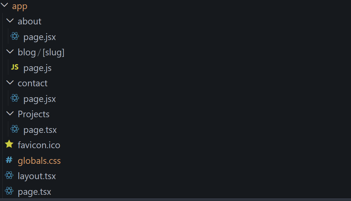
I also included a custom icon favicon.ico in app, which appears in the browser tab:
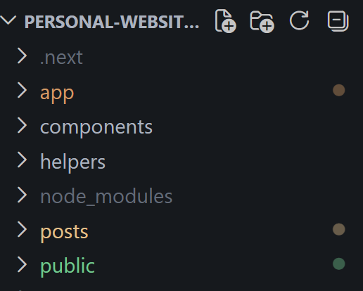
In addition to app, we have a public folder in our root to hold media for our website:
All other files would be added later during development.
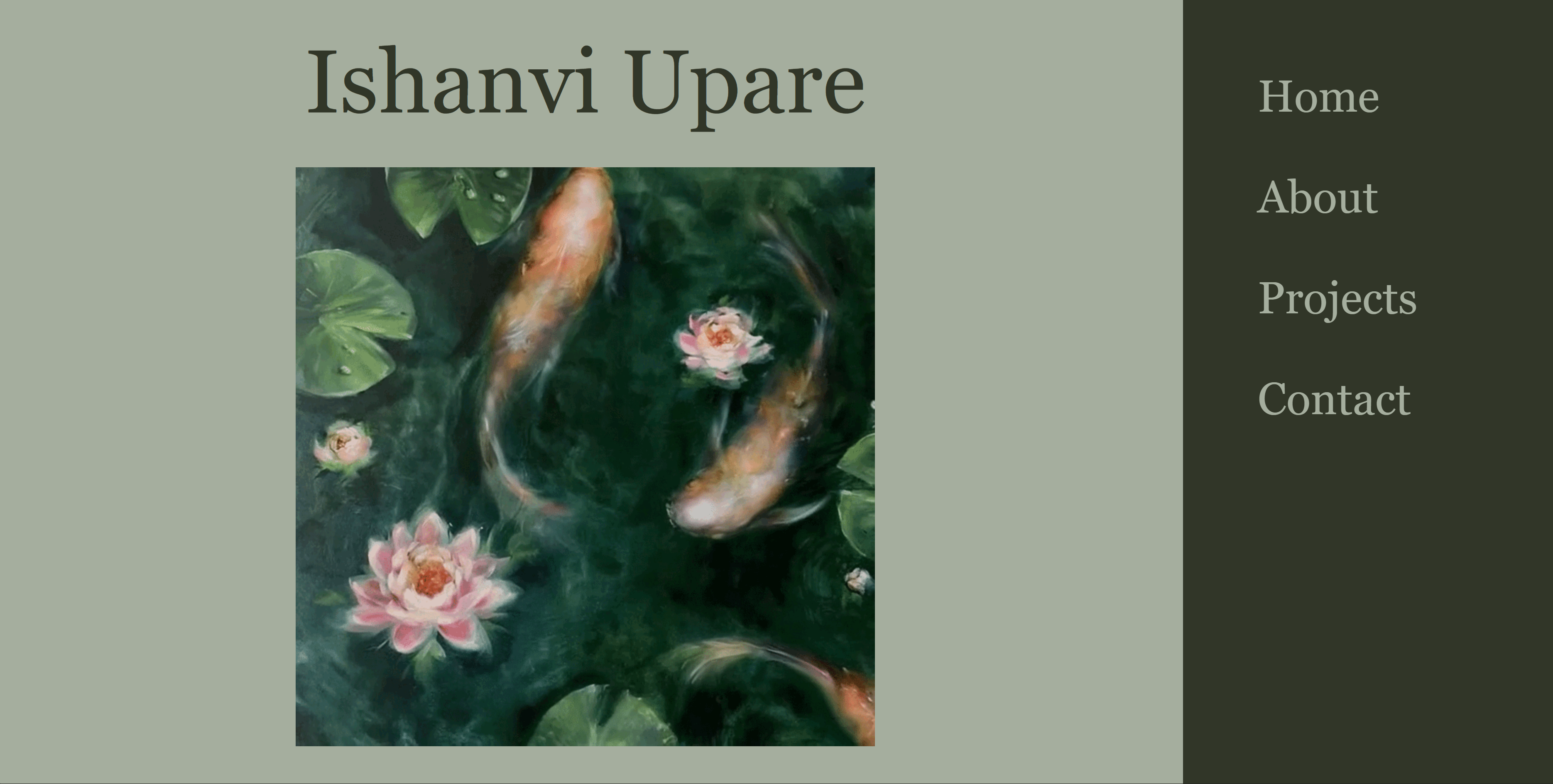
Home Page and Navigation
When designing the home page, I decided that I wanted it to feel like the cover page of a book.
Navbar Component
I created a navbar.jsx file and defined a NavBar component:
export default function Navbar() {}
I then proceeded to position it within layout.tsx:
<html lang="en">
  <body className={`${geistSans.variable} ${geistMono.variable} antialiased flex`}>

    <main>
      {children}
    </main>

    <Navbar />

  </body>
</html>
Due to having a sidebar, I needed to ensure pages didn't render under the sidebar. So, I cut out 1/4 of the screen:
<main classname = "w-3/4">
  {children}
</main>
Then, I styled my NavBar:
<div className={`bg-[#313628] text-[#A5AE9E] fixed top-0 right-0 h-screen w-1/4 flex flex-col p-20 gap-15 text-5xl font-serif`}>
Beautiful! However, I wanted my home page to be a different color than the rest of the website pages. That would include checking if the current path was the homepage or not.
Conditional Rendering
In order to change the color of my pages and NavBar, I needed to be able to access the current path:
import { usePathname } from 'next/navigation'
I defined constant variables to hold a boolean value for whether the current page was the home page:
const pathname = usePathname()
const isHome = pathname === '/'
And I used conditional rendering to change the color of my pages based on my pathname:
const bgColor = isHome ? 'bg-[#313628] text-[#A5AE9E]' : 'bg-[#5a4a46] text-[#c6b0ad]'
  return (
    <div className={`fixed top-0 right-0 h-screen w-1/4 flex flex-col p-20 gap-15 text-5xl font-serif ${bgColor}`}>
  )
 Yay!
Yay!
Hover Animations
I also wanted to implement hover animations for my NavBar. This would involve using the hover pseudo-class and the transition utility class.
<Link href="/" className="group flex items-center gap-2 transform-gpu transition-all duration-300 hover:scale-105 hover:text-[#ddd6cd]">
  Home
  <span className="w-6 text-center opacity-0 group-hover:opacity-100 transition duration-300">
    𓆝
  </span>
</Link>
This implementation features a smooth transition between each page link, as well as an appearing fish on hover events:

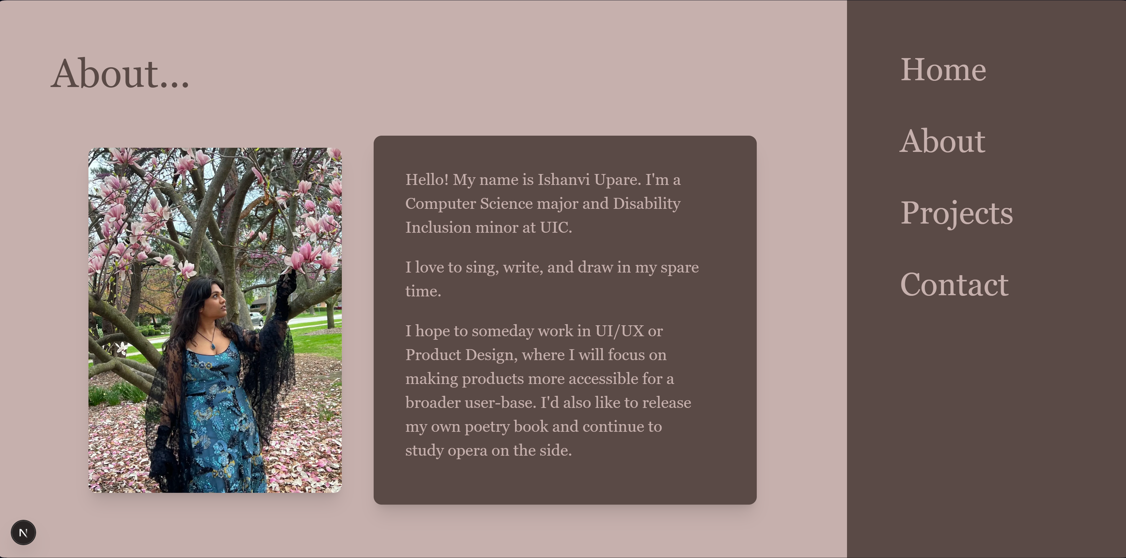
About Page
This page shares a photo of me and a short description of myself.
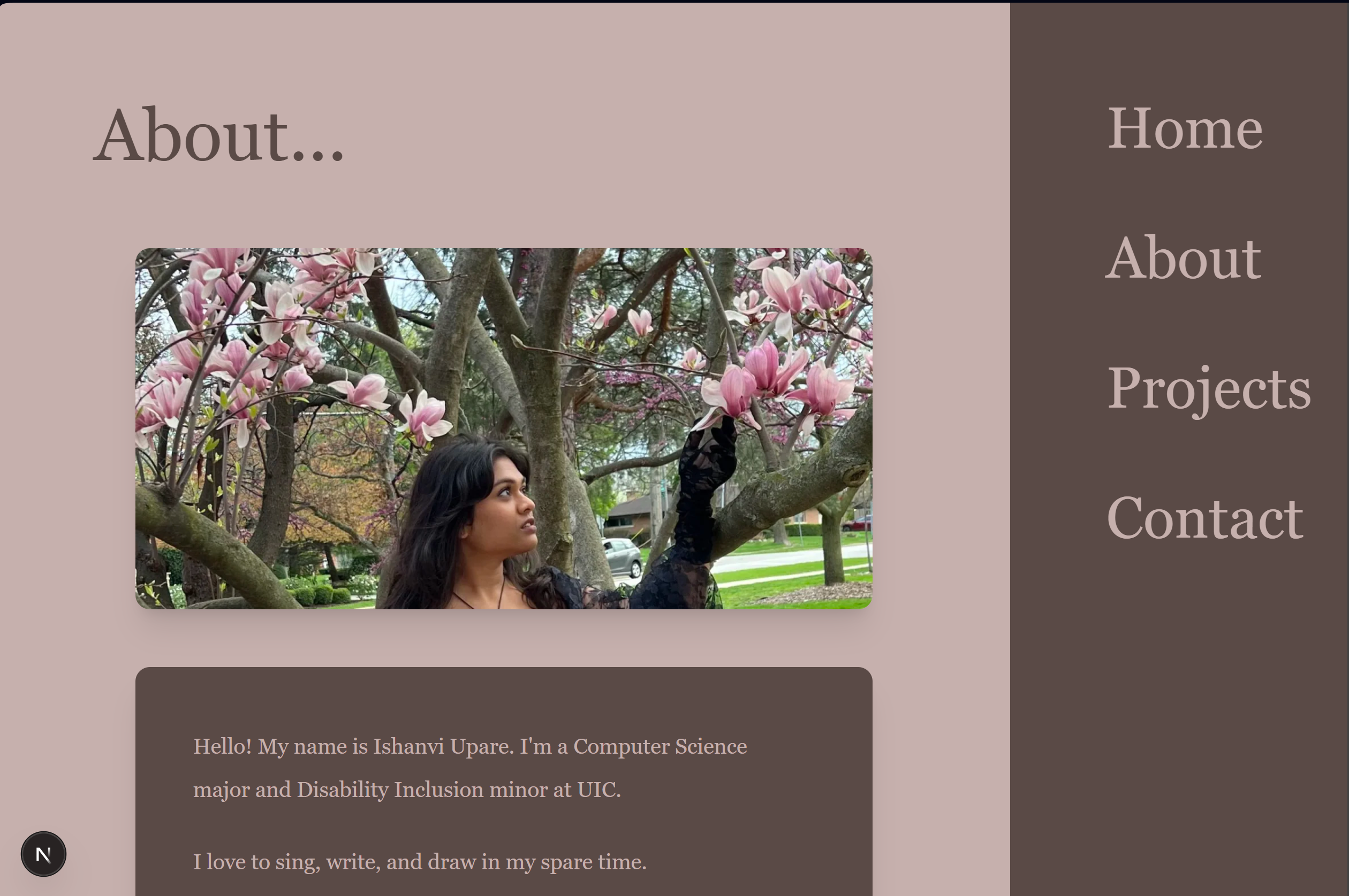
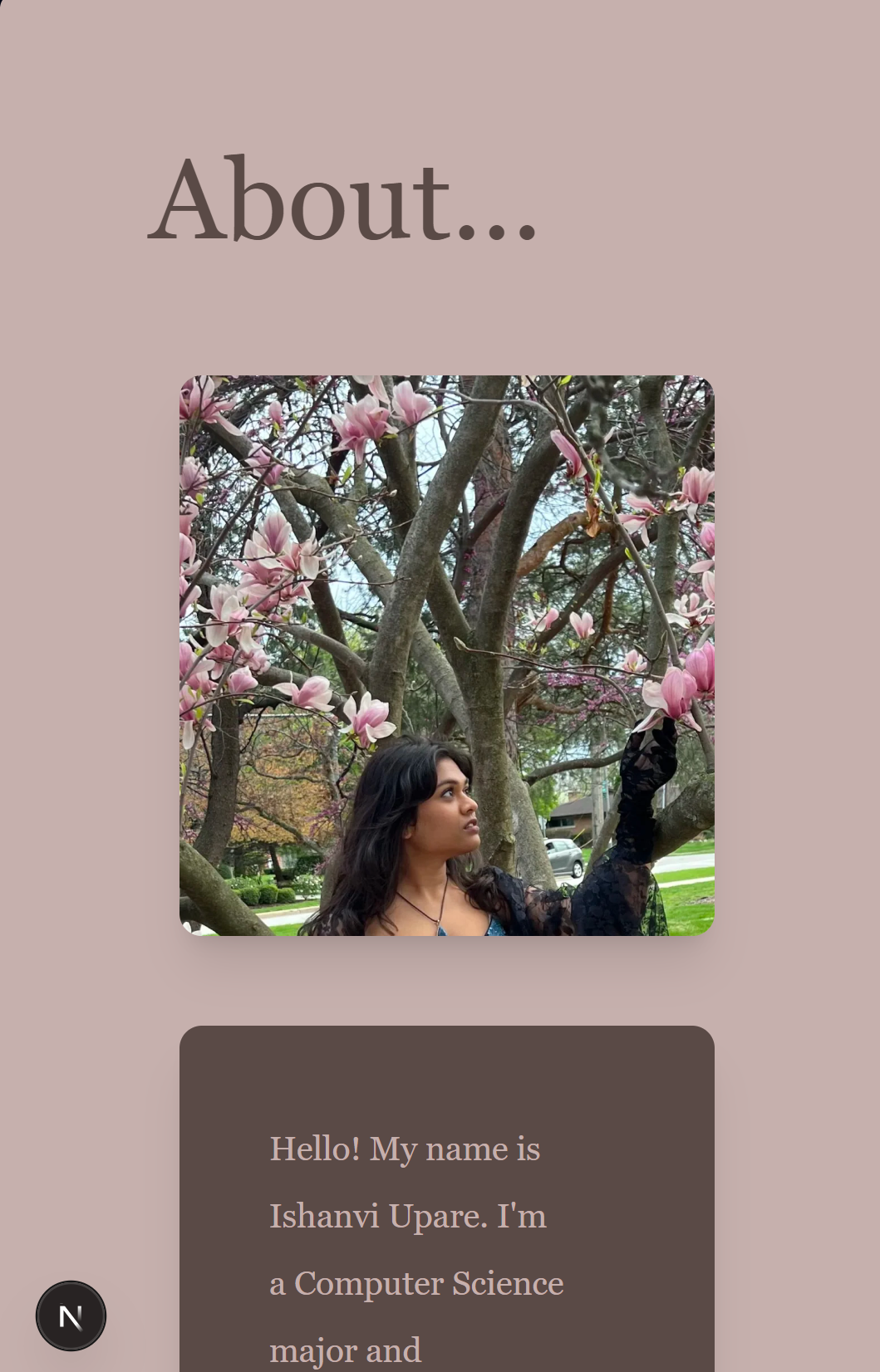
Responsive Design
I used flex and Tailwind breakpoints to implement responsiveness for my About page:
<div className="h-auto xl:h-screen overflow-auto xl:overflow-hidden">
  <div className = "h-full bg-[#c6b0ad] text-[#5a4a46] font-serif p-20 flex flex-col">
    <h1 className = "text-6xl mb-16"> About... </h1>
    <div className = "min-h-0 mx-auto max-w-9/10 max-h-full flex flex-col xl:flex-row gap-12">

      <div className = "xl:w-2/5 flex flexcol sm:justify-center items-center">
        <div className = "w-full h-[300px] xl:h-auto overflow-hidden rounded-xl shadow-xl">
          <img src = "profile.webp" className = "object-cover object-center w-full min-w-50 h-full min-h-130"/>
So that my page could do this:
Custom Scrollbar
I wanted my text container to retain its size and scroll on overflow, so I used overflow-y-auto. However, this resulted in a boxy scrollbar that didn't quite match my theme. To fix this, I decided to implement a custom scrollbar style:
.scrollbar-custom {
  scrollbar-gutter: stable;
}

/* hide scrollbar by default */
.scrollbar-custom::-webkit-scrollbar {
  width: 0px;
}

/* show when hovering the container */
.scrollbar-custom:hover::-webkit-scrollbar {
  width: 4px;
}

/* style it */
.scrollbar-custom::-webkit-scrollbar-thumb {
  background-color: rgba(198, 176, 173, 0.7);
  border-radius: 10px;
}
And then I added it to my container:
<div className = "h-full overflow-y-auto pr-10 -mr-2 scrollbar-custom space-y-6">
Now the scroll bar doesn't have an out of place track, and it only appears when hovering over the container:

Projects Page
Initially, my projects section was going to be a simple scrolldown with a list of projects and explanations. However, after learning a little about how to structure a blog using markdown (.md) files during a WebDev meeting, I decided to go down that route.
Markdown Files
I created a posts directory in the root to hold all my markdown files. Each markdown file begins with the following structure:
---
title: Personal Website
subtitle: Learning WebDev
start: 2026-02-05T00:00:00-06:00
end: 2026-04-26T00:00:00-06:00
image: "nav.png"
---
The YAML frontmatter delimiters (---) at the top of the file constrain a block of metadata to be parsed called frontmatter.
Here, we define our frontmatter fields. In my case, I defined title, subtitle, start, end, and image.
To note, 2026-02-05T00:00:00-06:00 is a YAML-formatted date and time represented in ISO 8601, with a generalized format of YYYY-MM-DDThh:mm:ssZ, with Z indicating the time is in UTC. YYYY-MM-DDThh:mm:ss±hh:mm can be used to indicate a specific timezone, where ±hh:mm is the offset from UTC.
After the frontmatter, the rest of the .md file is just the Markdown content, and uses basic Markdown syntax.
Each .md file is used to hold metadata and text that will be rendered as an individual blog page later.
Dynamic Routing
Since the pages are generated from Markdown files rather than explicitly defined routes, we use dynamic routing to catch URL segments as slugs.
In app, I created a directory blog. Within it, I created the directory [slug], a dynamic segment that catches the matching URL segment and passes it as a parameter with a usable slug. page.js is within [slug], and it holds the logic for rendering each individual BlogPage after receiving the slug property.
To build page.js's logic, we use two helper functions:
We use fs for file reading, path for path building, and gray-matter for parsing frontmatter:
import matter from 'gray-matter'
import path from 'path'
import fs from 'fs'
getListOfPosts returns an array of objects, one object for each .md file in posts. Each object contains properties parsed from the frontmatter using gray-matter, as well as a slug property coming from the name of the .md file:
export const getListOfPosts = () => {
  const folder = path.join(process.cwd(), 'posts')
  const files = fs.readdirSync(folder)
  const mdFiles = files.filter(file => file.endsWith('.md'))

  return mdFiles.map(filename => {
    const contents = fs.readFileSync(path.join(folder, filename), 'utf8')
    const { data } = matter(contents)

    return {
      ...data,
      slug: filename.replace('.md', '')
    }
  })
}
getPostContent takes a singular slug and reads the matching .md file to return a singular object with data and content properties. data contains properties parsed from the frontmatter, while content contains the Markdown content. Now, we can access specific properties with {data.keyName}, and we can display the Markdown content of the .md file with {content}:
export const getPostContent = (slug) => {
  const file = path.join(process.cwd(), 'posts', slug) + '.md'
  const content = fs.readFileSync(file, 'utf8')
  return matter(content)
}
We can now use our helper functions for page.js:
We make sure to import our helper functions, as well as the BlogPage component (detailed in the next section):
import { getPostContent, getListOfPosts } from "@/helpers/postHelpers"
import BlogPage from "@/components/BlogPage"
generateStaticParams is a Next.js function that returns each available slug in posts so each BlogPage can be pre-built at build time:
export const generateStaticParams = async () => {
  const posts = getListOfPosts()
  return posts.map(post => ({ slug: post.slug }))
}
Post takes in the current slug and renders a BlogPage with the Markdown content and metadata from the .md file of the same name:
async function Post({ params }) {

  const resolvedParams = await params
  const {content,data} = getPostContent(resolvedParams.slug)

  return (
    <div>
        <BlogPage content={content} data={data}/>
    </div>
  )
}
Now that we can access each post’s data through dynamic routing, we can focus on rendering that data into a blog page.
Blog Rendering Components
To render each .md file, I created two components:
BlogIndex's purpose is to render a clickable index in our parent route for each blog page.
function BlogIndex({ posts }) {
  return ( ... )
}
This component returns a responsive grid of clickable cards that resemble pinned Polaroid images:
First, I created a grid that will have as many columns as the available screen space allows:
<section className="
  grid gap-12 px-10 w-full
  grid-cols-1
  sm:[grid-template-columns:repeat(auto-fit,minmax(250px,250px))]
  ">
</section>
Next, we map over the posts array to access the slug property for routing:
{
  posts.map(post => (
    ...
  ))
  }
We wrap everything in a <Link> to allow the whole card to be clickable:
<Link key={post.slug} href={`blog/${post.slug}`} className=" font-bold text-xl">
  ...
</Link>
Then, I created the card. First, I created the pin overlay, which covers part of the card using absolute:
<img src="/pin.png" className="absolute -top-3 left-1/2 -translate-x-1/2 w-11 h-11 z-20"/>
Then, I created a cream-colored card to act as the picture frame:
<div className="bg-[#ddd6cd] pt-5 px-4 pb-10 mx-auto w-full max-w-[320px] shadow-lg">
Then, we look for our image and title properties taken from the .md file's metadata and place it in our card:
<article>
  <img
    src={post.image}
    className="w-full aspect-[3/4] object-cover mb-4"
  />
  <p className = "">
    {post.title}
  </p>
</article>
Finally, I realized I wanted it to feel like you were searching through the photos and picking one up. To do this, I used hover:rotate-3. However, I also had to add pointer-events-none to the pin to ensure it didn't move along with the card.
Next, I created the component BlogPage, which renders the metadata and content of each .md file as a page:
import ReactMarkdown from 'react-markdown'

function BlogPage({ content, data }) {
  return (
    <>
      <div className="h-full p-20 bg-[#c6b0ad] font-serif text-[#5a4a46] text-xl">

        <div className= "mx-auto max-w-4xl p-5 mb-12 bg-[#5a4a46] text-[#c6b0ad] rounded-xl shadow-xl">
          <h1 className = "text-6xl mb-3">{data.title}</h1>
          <h2 className = "indent-1 mb-2">{data.subtitle}</h2>
          <h2 className = "indent-1">{new Date(data.start).toLocaleDateString()}</h2>
        </div>

        <article>
          <ReactMarkdown>
            {content}
          </ReactMarkdown>
        </article>
      </div>
    </>
  )
}

export default BlogPage
At the top , the properties from the frontmatter of the .md file are used to create a header card on the page. Then, the Markdown content is parsed and rendered using ReactMarkdown, which allows Markdown content to be rendered as formatted HTML.
Using these, we can easily render a basic blog page. However, we need some additional tweaks for nicer formatting, since ReactMarkdown can't accomplish certain things by default.
Formatting Markdown Content
After rendering, I realized I needed to format my Markdown files for my page. To simplify this, I decided to use the tailwindcss-typography plugin. I also could've just written my own styles to use in globals.css.
With Tailwind v4, I could add plugins without the need of a tailwind.config.js file by just writing directly into globals.css:
@plugin "@tailwindcss/typography";
Using the prose utility class, I specified formatting for Markdown syntax in BlogPage.jsx:
<article className = {`
  prose
  max-w-4xl mx-auto
  font-serif text-[#5a4a46]
  prose-p:leading-8
  prose-headings:text-[#5a4a46] prose-headings:mb-2
  prose-strong:text-[#5a4a46] prose-a:text-[#5a4a46]`}>
I also wanted themed code blocks, so I added rehype-highlight, which uses the Highlight.js library to add themes to Markdown code blocks.
I imported my theme of choice in globals.css:
@import "highlight.js/styles/atom-one-dark.css";
And added rehype-highlight to BlogPage:
import rehypeHighlight from "rehype-highlight"
<ReactMarkdown rehypePlugins={[rehypeRaw, rehypeHighlight]}>
  {content}
</ReactMarkdown>
Reading HTML in Markdown Files
I wanted to see if I could embed existing websites within a page, and learned that it was possible with <iframe>s. However, I quickly learned that ReactMarkdown didn't support rendering HTML within .md files. So, I used rehype-raw in BlogPage.jsx to allow HTML to render:
import rehypeRaw from 'rehype-raw'
<ReactMarkdown rehypePlugins={[rehypeRaw]}>
  {content}
</ReactMarkdown>
This worked, but then I found that scroll events within the embedded website also triggered in the page, causing the page to scroll before the embed. My solution was to overwrite <iframe> with a component that would stop the parent from scrolling when using the embed.
ResponsiveIFrame creates an <iframe> that hides overflow when focused on it, locking away parent scroll behavior:
export default function ResponsiveIFrame({ className = "", ...props }){
    return (
        <div
            className="not-prose"
            onPointerEnter={() => {
                document.body.style.overflow = 'hidden'
            }}
            onPointerLeave={() => {
                document.body.style.overflow = ''
            }}
        >
        <iframe {...props} className = {`${className}`}> </iframe>
        </div>
    )
}
This fixed the website issue. However, when embedding videos on a separate page, I realized that hovering over videos would cause the same scroll disabling behavior, as I overwrote <iframe> entirely for my Markdown files. This would disable scrolling in unsatisfying and unintended ways for my page. To fix this, I added a "YouTube" condition to ResponsiveIFrame:
const src = props.src || ""
if (src.includes("youtube") || src.includes("youtu.be")) {
  return (
    <iframe {...props} className={`not-prose mx-auto aspect-[3/2] max-h-100 ${className}`}></iframe>
  )
}
This would also make it so I wouldn't have to re-style every YouTube embed.
Time Surpassed Metadata
In addition to the original date started, I wanted to display how much time I had worked on something. I implemented this by adding start and end frontmatter fields to my markdown files. start would be parsed and then created into a Date object to display as the starting date, but I needed a helper function to display the time surpassed between start and end.
I wrote the function formatTime for this, which calculates and converts the start and end properties into year, month format. It also accounts for non-plural cases, as well as short and ongoing projects:
export function formatTime({ start, end }) {
  const startDate = new Date(start)
  const endDate = end ? new Date(end) : new Date()

  let years = endDate.getFullYear() - startDate.getFullYear()
  let months = endDate.getMonth() - startDate.getMonth()

  //conversion
  if (months < 0) {
    years--
    months += 12
  }

  //build string parts
  const parts = []

  //plural cases
  if (years > 0) {
    parts.push(`${years}yr${years > 1 ? "s" : ""}`)
  }

  if (months > 0) {
    parts.push(`${months}mo${months > 1 ? "s" : ""}`)
  }

  //if short project
  if (parts.length === 0) {
    parts.push("less than 1mo")
  }

  let result = `For ${parts.join(" ")}`

  //if ongoing
  if (!end) {
    result += " (ongoing)"
  }

  return result
}
Possible outputs include "For 4yrs 1mo", "For 1 yr 2mos (ongoing)", and "For less than 1mo".
Contact Page
This page acts as a way to access my contact information.
Hyperlinks and Redirection
According to my design, I wanted each icon to act as a hyperlink to my contacts. To do this, I wrapped each image around an anchor tag:
<a href = "https://github.com/ishanviupare">
  <img src = "/Github.png" className = "w-25"/>
</a>
This turned each icon into a clickable link. By adding blank targets to my links, I made it so new tabs would be opened rather than replacing the current page:
<a href = "https://www.linkedin.com/in/ishanviupare/" target = "_blank">
Deployment
After development, we deployed our websites using Vercel by connecting our GitHub repositories:
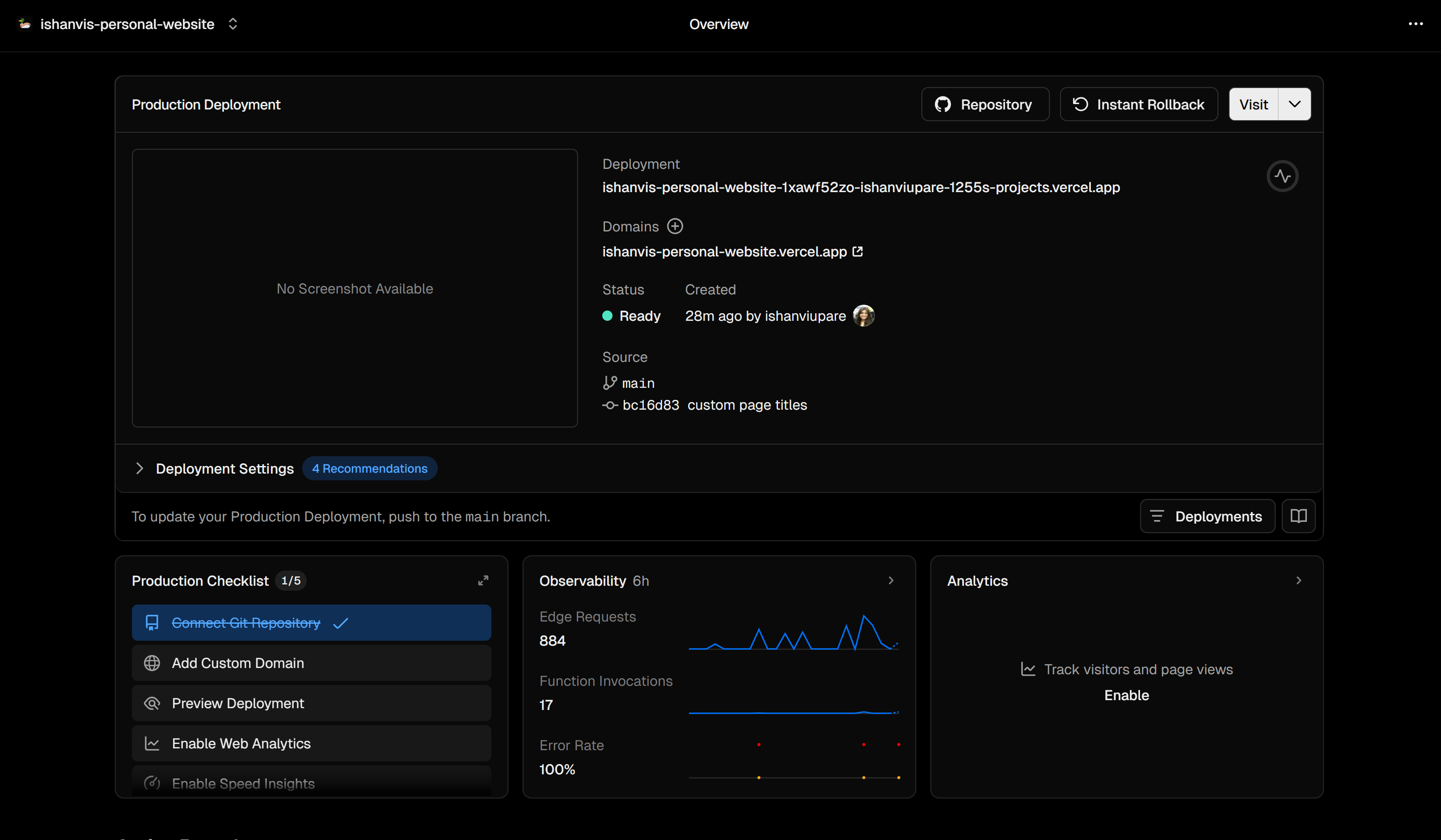
This handles automatic deployments whenever changes are pushed to the repository, meaning the site is always up-to-date.
This also means we can share a link to our website with others!